I conducted interviews and created empathy maps to better understand the users I’m designing for and also the needs of the users. Two primary user group identified through research was Students and working class individuals who don’t have time to cook .Research reveals that time and busy schedule isn’t the only limiting factors for users not making their own food. Other users problems included language barrier, obligations or challenges that make it difficult to get groceries for cooking or going to restaurants in person.
Interviews
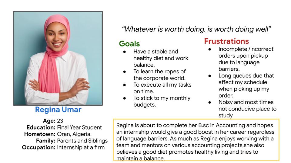
I wanted to form a deeper understanding of our users' goals, needs, experiences, and behaviors. So, I created 2 personas for each of our user segments. They were based on user interviews, and I kept updating them throughout the project as I gathered more data. I used these personas whenever I wanted to reconsider my initial ideas.
Personas
.jpg)
User Journey
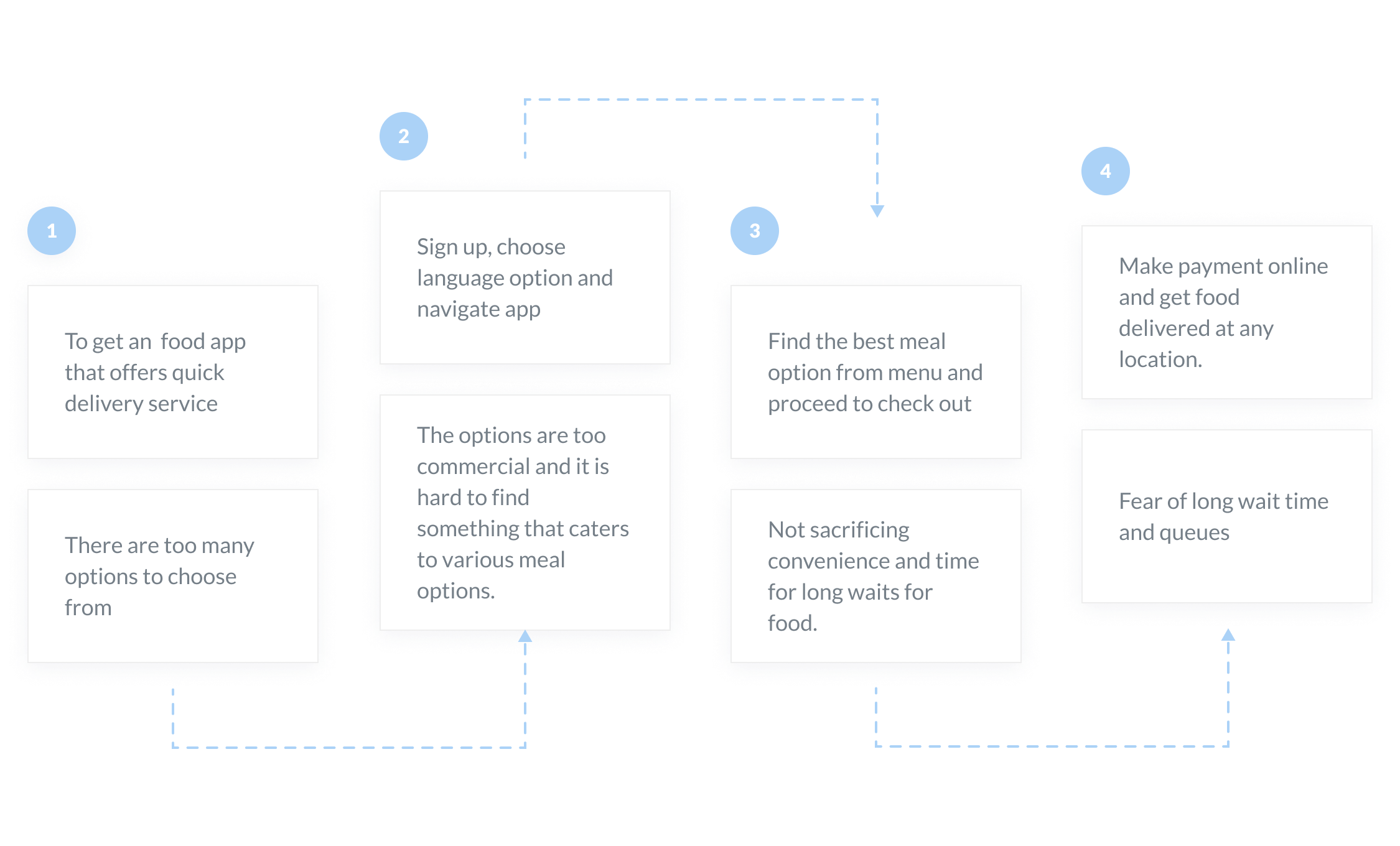
With the business goal in mind, I ensured that users reach the checkout screen without any hiccups. So, I sketched a current-state user journey map, to identify opportunities for improvement. I identified 2 unnecessary steps and potential drop off points in the flow. By eliminating these from the new design, I ended up with a much faster checkout experience that contributed to conversion rates.
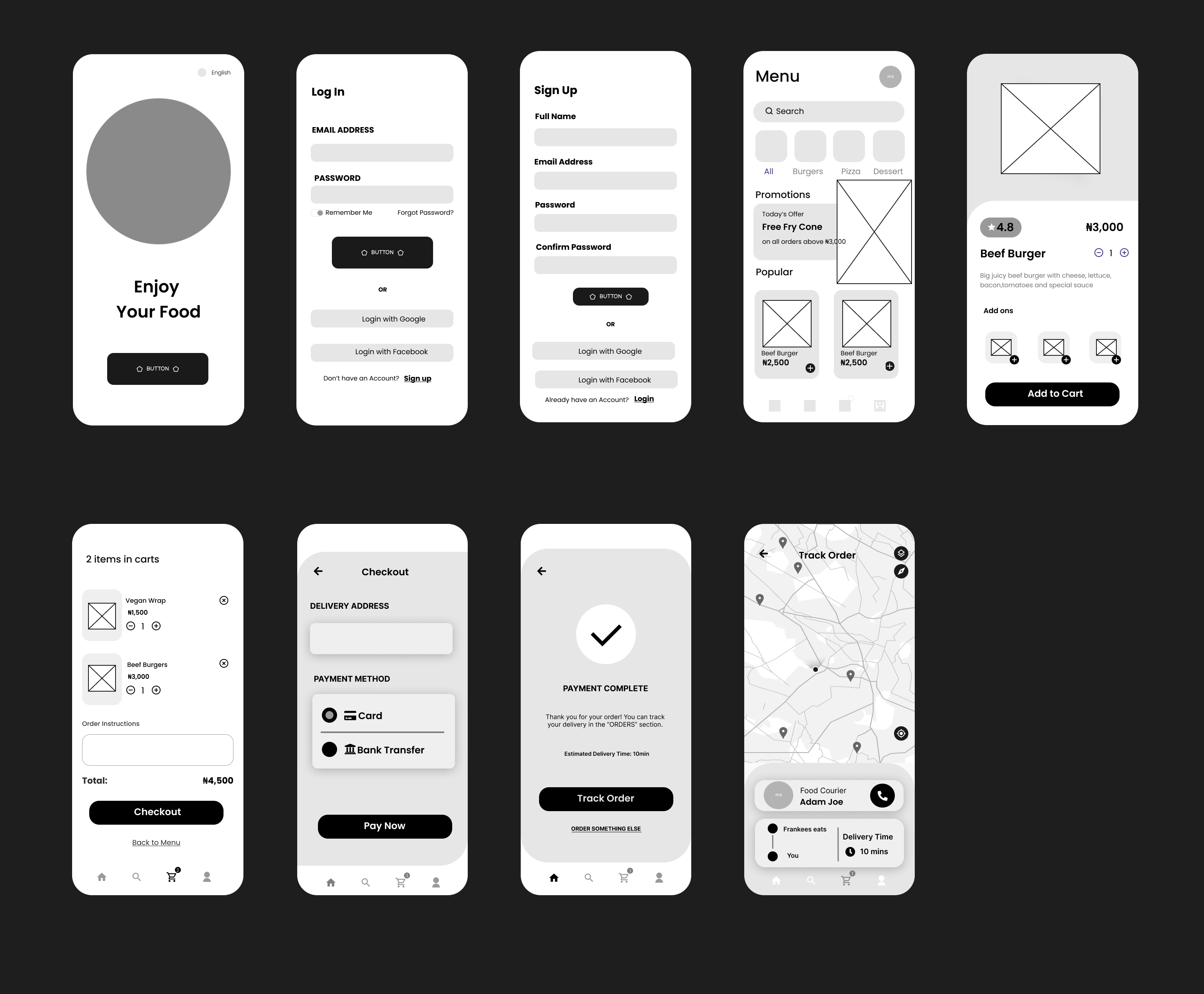
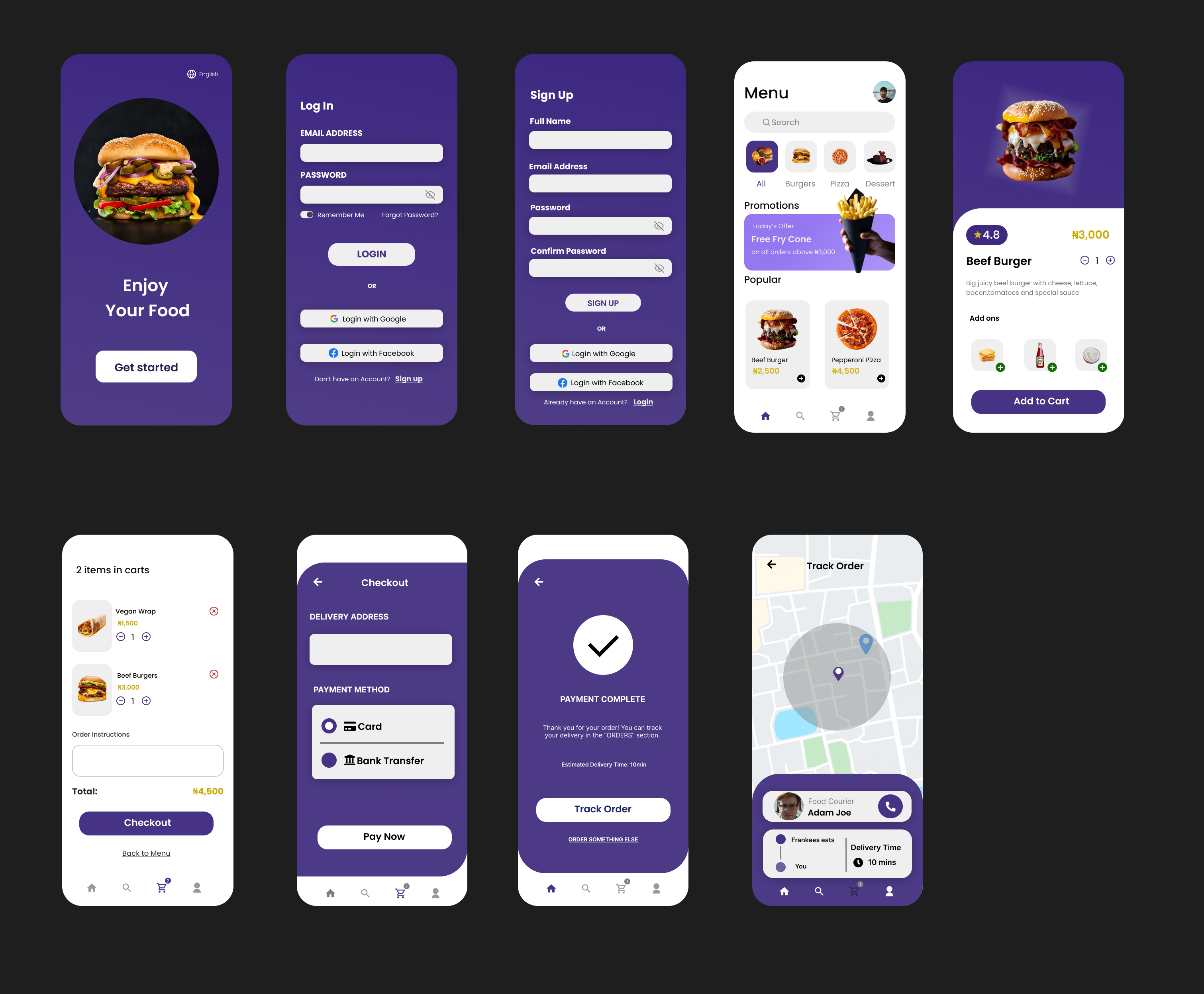
During the course of this case study and design, I learnt more on colors and making use of fonts to aid with accessibility. On Figma, I got to come across various plugins that helped the design come to life. I also did learn how to conduct interviews with an open mind and also ask open-ended questions.It was my first time designing a food app interface so it was a bit tricky finding the right images and adjusting them to the required sizes. I also tried giving myself time limits while designing this project. This project helped me put all I've studied about empathizing with users into practice and it made me understand that as a UI/UX designer its more than just designing on Figma, you can only deliver well when you empathize with your users.
