Osose

As a UX researcher on the construction company website redesign project, I identified the key challenge faced by contractors and civil engineers in accessing equipment in high demand also, the original website had a cluttered design that was visually overwhelming and disorienting to users. My objective was to design a user-centered solution that facilitated a seamless user journey and ensured ease of navigation. Through the research and design process, I was able to successfully address this pain point, resulting in a more streamlined and efficient experience for the users.
As a UX researcher for Aldavison Construction Company Limited, I conducted a comprehensive analysis of the existing website and identified opportunities for improvement. To address these issues, I implemented several design changes to enhance the overall user experience. This involved organizing the information into clear sections, using a neutral color palette, and incorporating easy-to-read fonts and clear images. These changes resulted in a significant improvement in the visual appeal of the website, making it more appealing to the target audience.Through a process of iterative design and user testing, I was able to ensure that the redesign of the website not only looked better, but was also more user-friendly and effectively met the needs of the target audience.
Figma
1 UX Designers
1 Project Manager
UX Research
UI Design
Overall: 5+ weeks
Discovery & Research: 3+ weeks
Design & testing: 2+ weeks
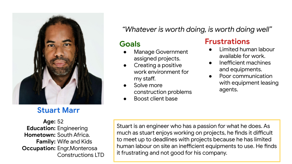
We wanted to form a deeper understanding of our users' goals, needs, experiences, and behaviors. So, we created 2 personas for each of our user segments. They were based on user interviews and surveys, and we kept updating them throughout the project as we gathered more data. We used these personas whenever we wanted to step out of ourselves and reconsider our initial ideas.
.png)
In alignment with the business objectives, our team has undertaken a comprehensive evaluation of the current user journey through the checkout screen. This involved creating a user journey map to highlight areas of inefficiency and potential dropoff points. Our findings revealed that the inclusion of constant phone calls and poor communication between sellers and buyers resulted in two unnecessary steps within the process. By removing these hindrances and streamlining the flow, we have successfully optimized the checkout experience, resulting in a marked increase in conversion rates.
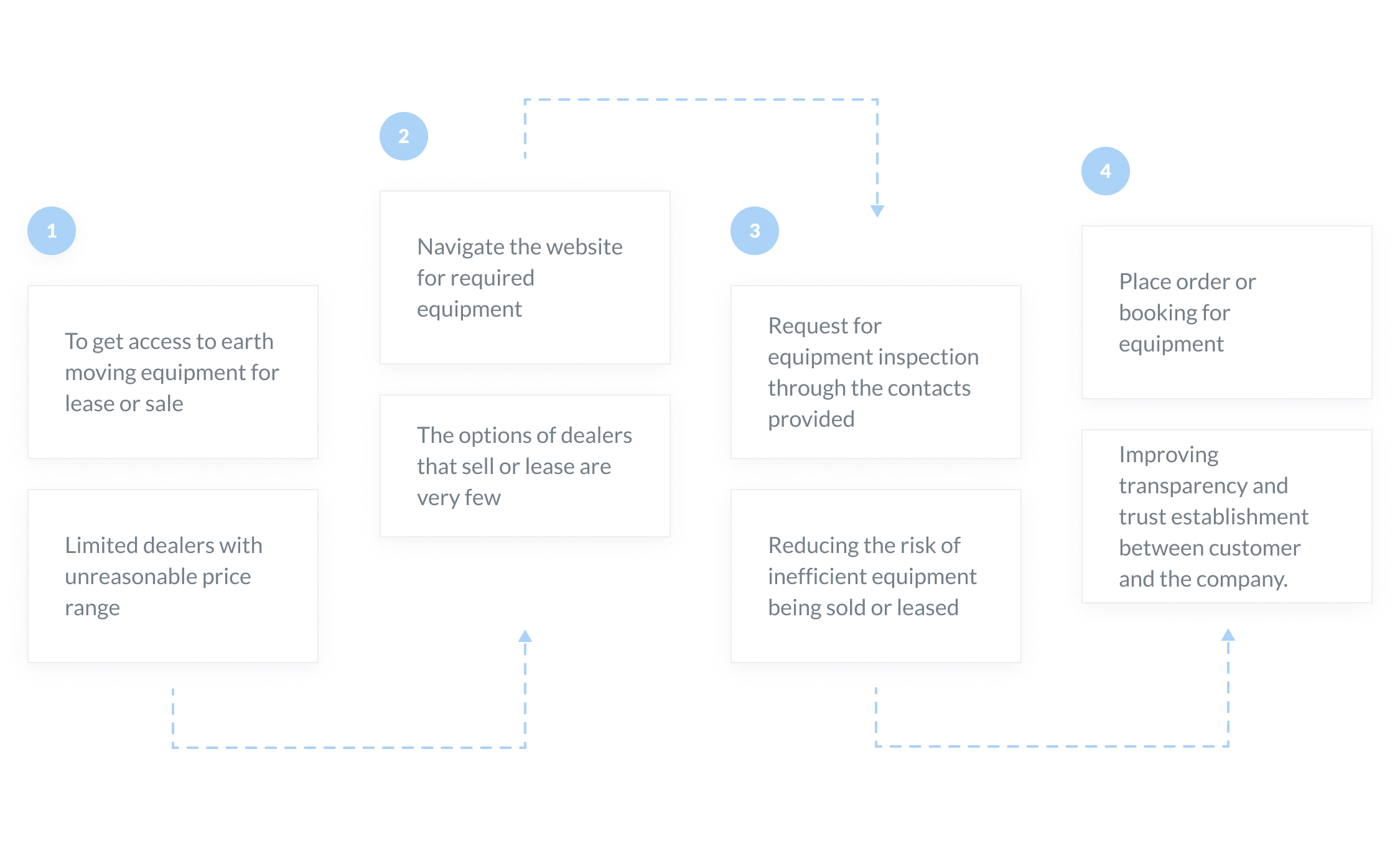
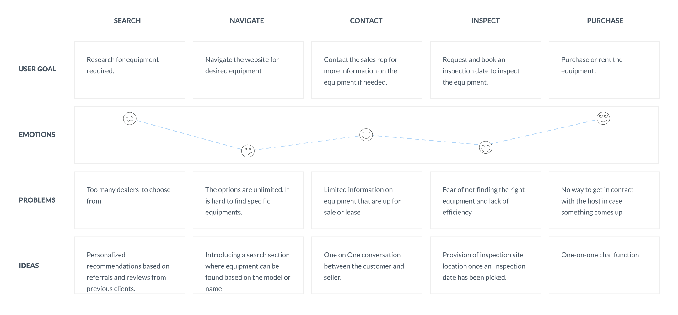
we conducted an analysis of the customer journey to gain a comprehensive understanding of the customer's experience while interacting with the service. The objective was to identify any potential challenges or areas of improvement. Our customer journey mapping exercise uncovered several pain points and areas of opportunity at the consideration and loyalty stages of the customer journey. Hence, we emphasized these stages in the design process and took proactive measures to address any challenges that arose during the research phase.
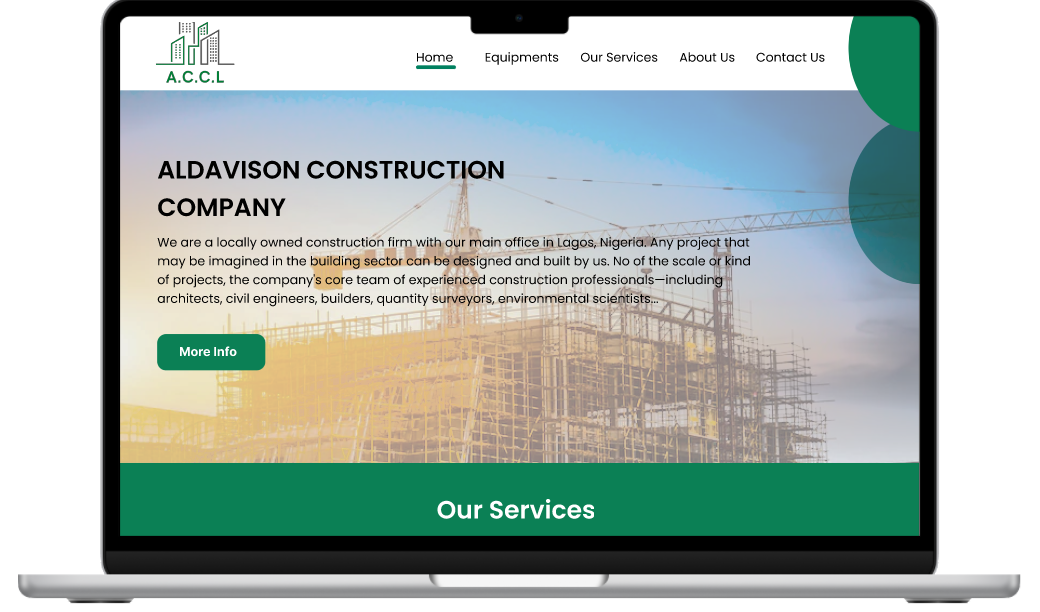
Once the usability issues were resolved, I moved on to design the final screens in Figma. My goal was to create a visual identity that’s aligned with the company's goal which is to ensure that contractors and engineers find access to efficient and well functioning equipment at negotiable prices. Also, I’ve checked the competition and took a deep dive into my catalog of references for inspiration.
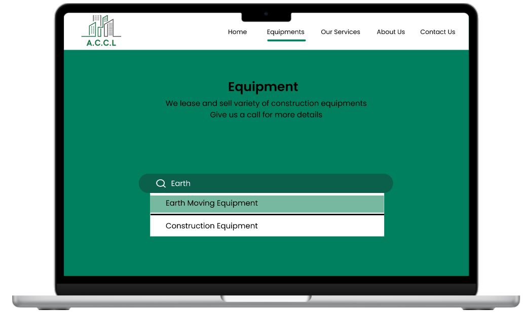
This project helped me be more confident in my designs and also helped me understand how the cooperate world works. Working with clients and their visions can be tasking but it is a challenge that I can take head on. This project has made me realize that as a designer, I can be versatile and thrive in any field.
If you like what you see and want to work together, get in touch!
ososeomozokpea.com